Sleeping at Last
This project involved designing a content strategy for the musician Sleeping at Last, by following the design life cycle and creating an interactive website prototype. This website aims to showcase the values of this artist as well as allow fans to connect with each other from anywhere in the world.
Client
Area
Year
Tools
The problem
The risk with musician websites is that they can be considered transactional since they mostly sell music and merchandise. For Sleeping at Last, whose music is defined by connection and meaning, it would feel wrong to create such a feeling on this website.
The goal was to create something that felt like an extension of the music itself: calm, considered, and community-oriented.
Competitive research
Before designing anything, I conducted an evaluation of two existing websites to understand what works well, what frustrates users, and what design patterns are worth keeping or avoiding.

Sonar Music Australia
A large sound production company with an extensive catalogue of music and audio content, Sonar's visual design was a strong point. Their good use of hierarchy, bold but readable typography, and well-labelled imagery made for an engaging first impression.
However, usability testing revealed challenges. The most consistent pain point was the absence of a search bar, every user mentioned it. One participant attempted to use Command+F to search the page manually; another gave up on a task entirely because they couldn't find what they were looking for. Slow page loading added to the frustration, with one participant describing the experience as "stressful."
There were also details that lowered trust among participants: including a misspelling as well as poorly formatted text.
Key takeaways:
A search bar should be a standard on websites with a lot of content
Loading speed and transitions have a large impact on user satisfaction
Consistent, repeating UI patterns (like labelled icon boxes) aid learnability
Errors within text or grammar damage credibility and user trust
Pollini
A long-running Italian luxury fashion brand, with a clean, minimal, and uncluttered design. The large product imagery made navigation intuitive and satisfying, and the site loaded quickly throughout.
The main friction points came from small, unlabelled icons that were hard to find, and localisation issues: some parts of the account registration flow appeared only in Italian. One tester also commented on the wording of certain headings to be misleading.
Key takeaways:
Minimalist design reduces cognitive load and increases satisfaction, but only if key features are still discoverable
Icons need to be either clearly labelled or universally recognisable
Users require accessible and intuitive language
From research to design
These findings shaped design decisions in the Sleeping at Last website. I carried the following recommendations directly into the design:
Design for learnability through consistency, by creating a component library with repeating patterns
Prioritise clear navigation labels
Be detail oriented by checking spelling and grammar
Keep the visual experience calm and uncluttered. The minimalist approach validated by the participants aligns naturally with Sleeping at Last's aesthetic
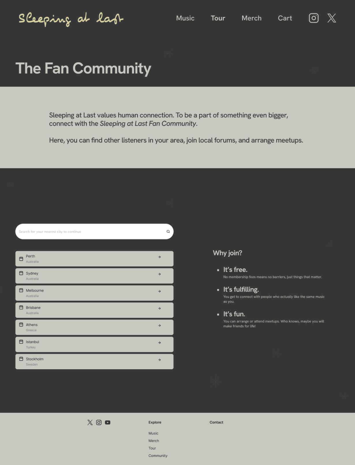
Identifying target users
Through secondary research, I built up a picture of the typical listener. These tend to be reflective and emotionally engaged individuals. Many discovered the artist through specific life moments, which creates a strong sense of personal connection to the music.
This research allowed me to develop a user persona, including the most common listener traits, goals, and frustrations. Grounding the design in this persona helped me make decisions that would serve real people.

Some relevant user goals for this website were also identified, including:
To find tour information and purchase tickets.
To find the artist's music and listen to it.
To purchase the artist's merchandise.
Brainstorming & wireframing
With a better understanding of the potential users, I moved into early ideation. Rough sketches allowed me to explore ideas quickly without getting invested in a single direction.

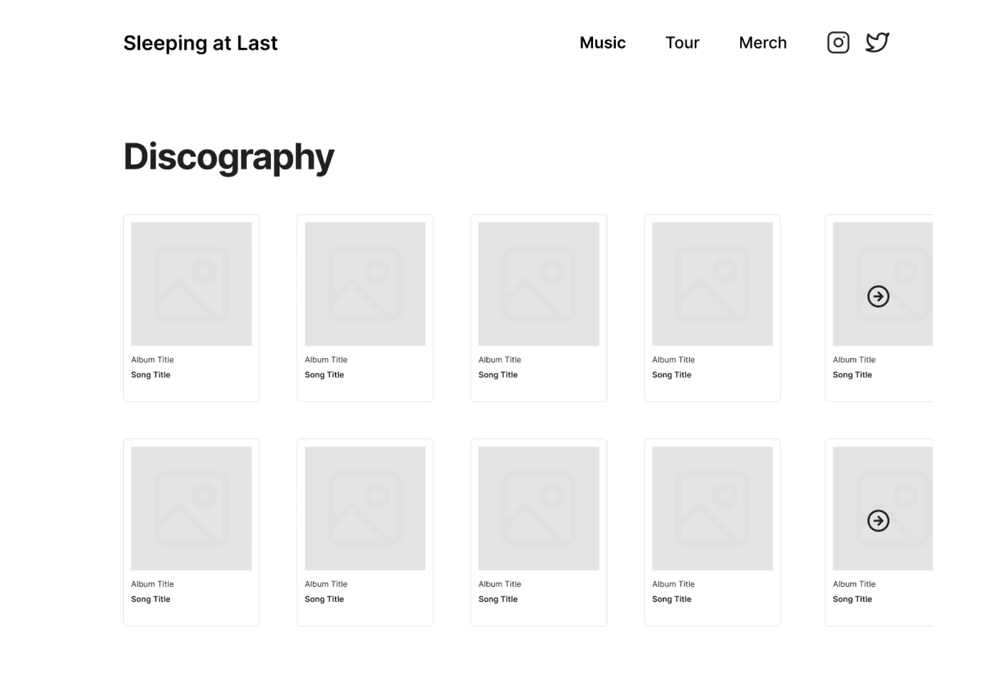
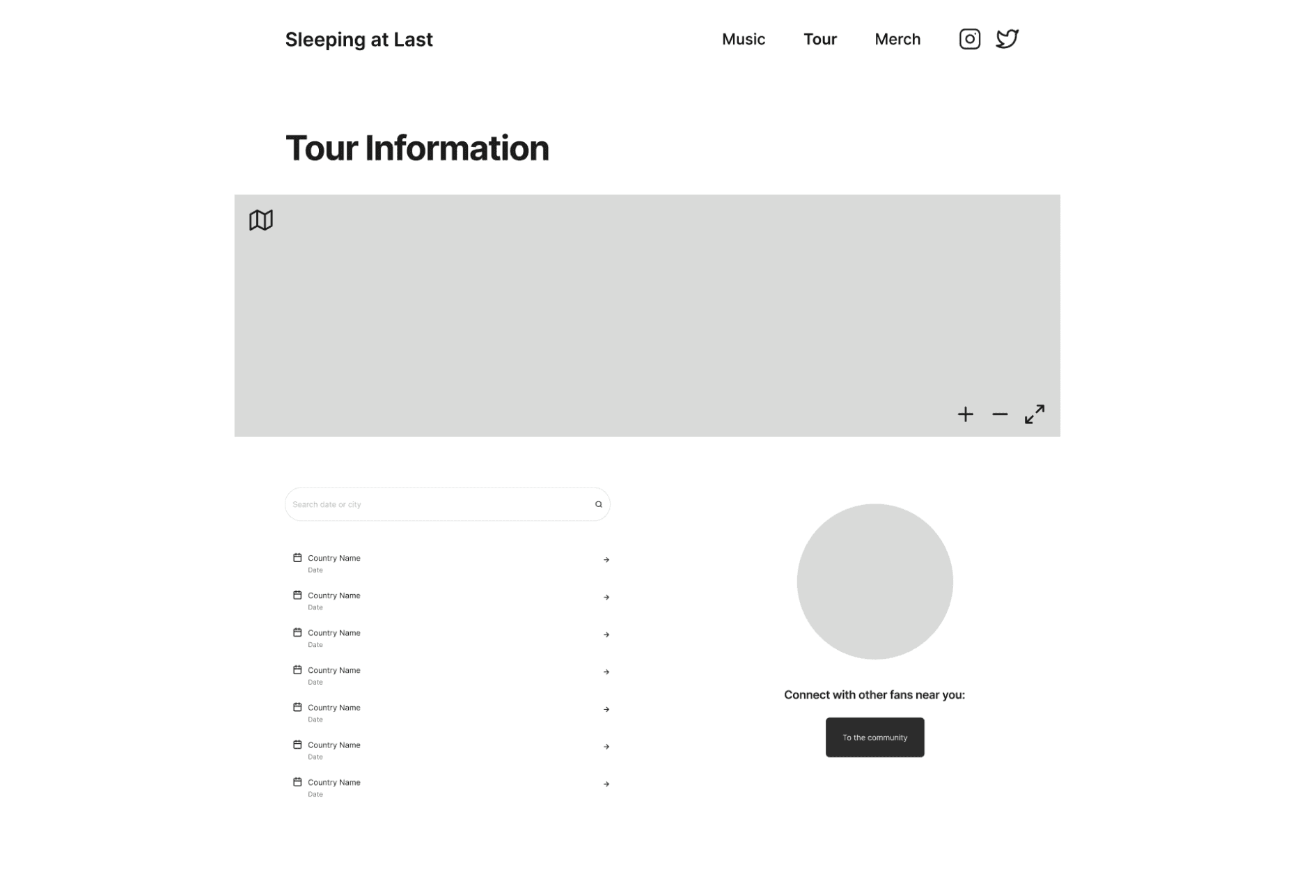
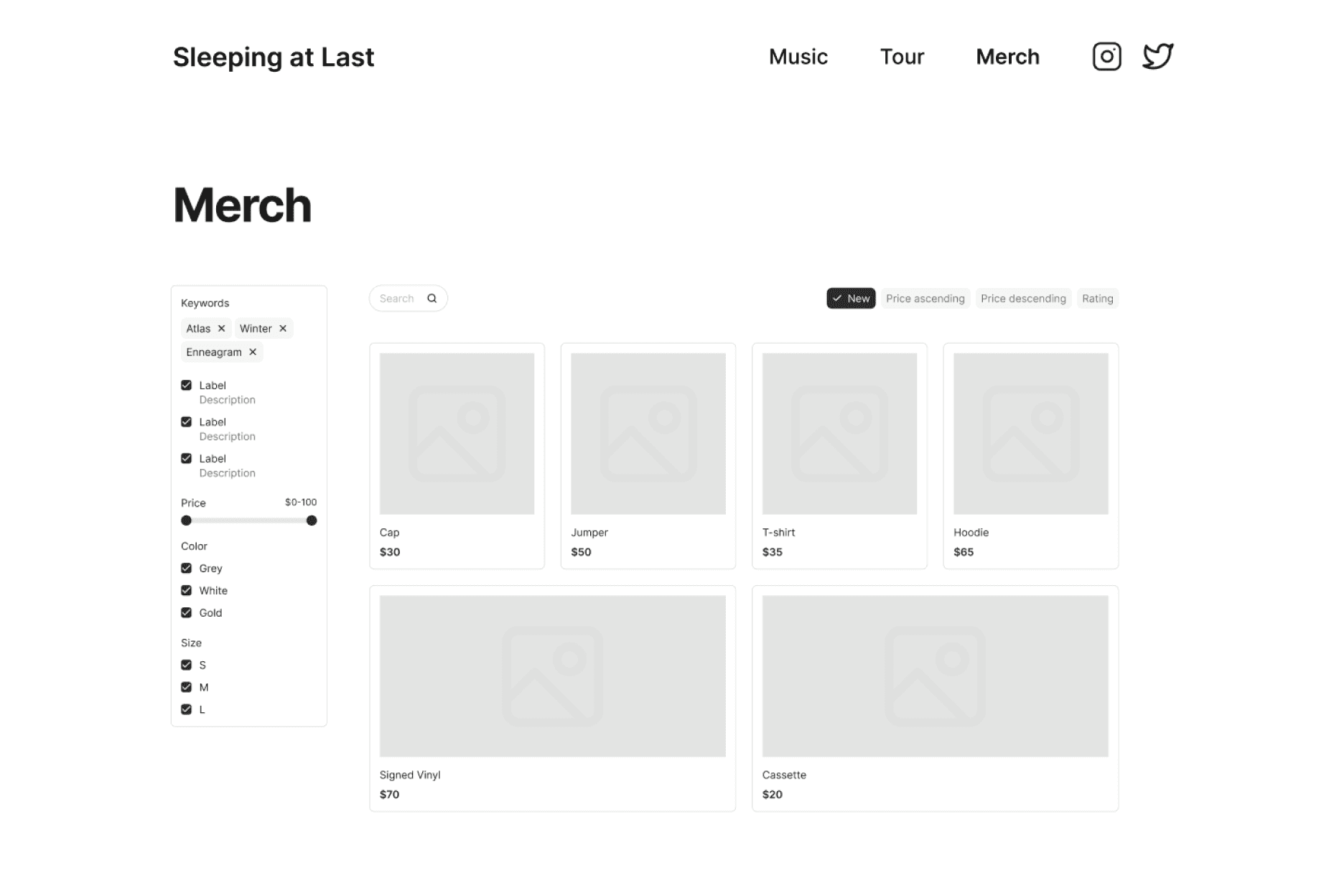
From there, I drew up some low-fidelity wireframes into Figma. There is a bit more detail but not enough that it is difficult to iterate or change. This also kept the focus on structure and hierarchy rather than visual style.

User flows
To understand how users would actually move through the site, I mapped out two user flows representing common tasks.


Design choices & final prototype
Before building the high-fidelity screens, I created a component and asset library in Figma. This meant that iterating was fast and the design stayed visually consistent throughout.

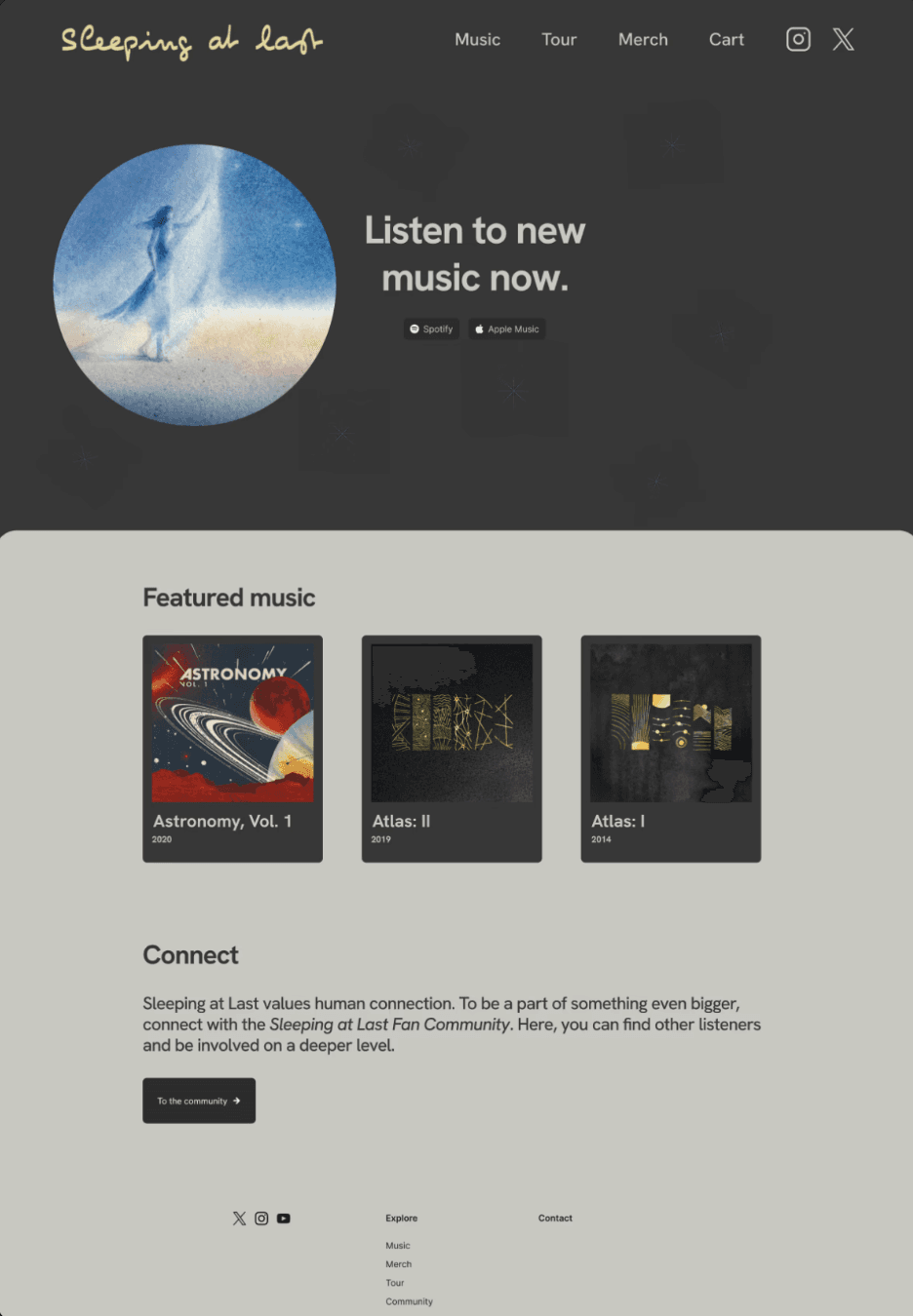
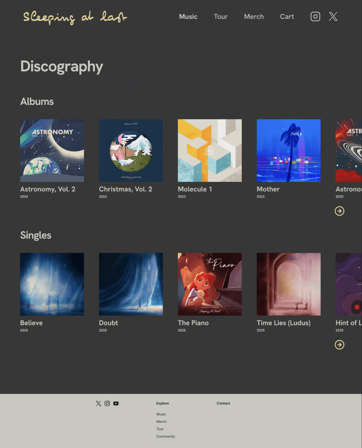
Colour palette
The palette was chosen to directly reflect Sleeping at Last's existing brand identity. A dark grey forms the foundation, creating a sense of calm and visual stillness that mirrors the tone of the music. This is paired with a soft yellow which is bold enough to draw the eye without disrupting the mood.
Imagery and visual language
My decisions regarding imagery aimed to reinforce the artist's identity. Stars appear faintly throughout as a symbol of hope, creating visual continuity between the site and the themes woven through the albums.
Typography and layout
Generous blank space and restrained typography were implemented to ensure the site doesn't feel busy or cluttered. The goal was a layout that lets users breathe, reflecting the same emotional space the music creates.


User testing
I then invited some participants to navigate the website and give feedback.
Overall, participants found the website easy to use and appreciated that it didn't feel cluttered or overwhelming.
The most actionable piece of feedback was consistent across most participants' feedback, which was the absence of a search function. Even with a navigation bar in place, participants felt that a search bar would be useful for finding something specific. This was also one of the findings from the research on Sonar, where every participant found the missing search bar to be frustrating.
In response, I added a recognisable search icon to the interface. Choosing an icon rather than a full text bar kept the visual design clean while still giving users what they were looking for. The universally understood magnifying glass icon meant it didn't need a label.
Before

After

Reflections
The biggest takeaway from this project was understanding the importance of lots of research and lots of ideation. Evaluating Sonar and Pollini before designing anything meant that the Sleeping at Last website was built with real evidence of user needs/opinions.
If I were to continue this project, I would want to conduct further usability testing to test whether the community features feel intuitive. I'd also revisit the mobile experience in more depth, as the prototype focused primarily on desktop.